Virginia State Parks
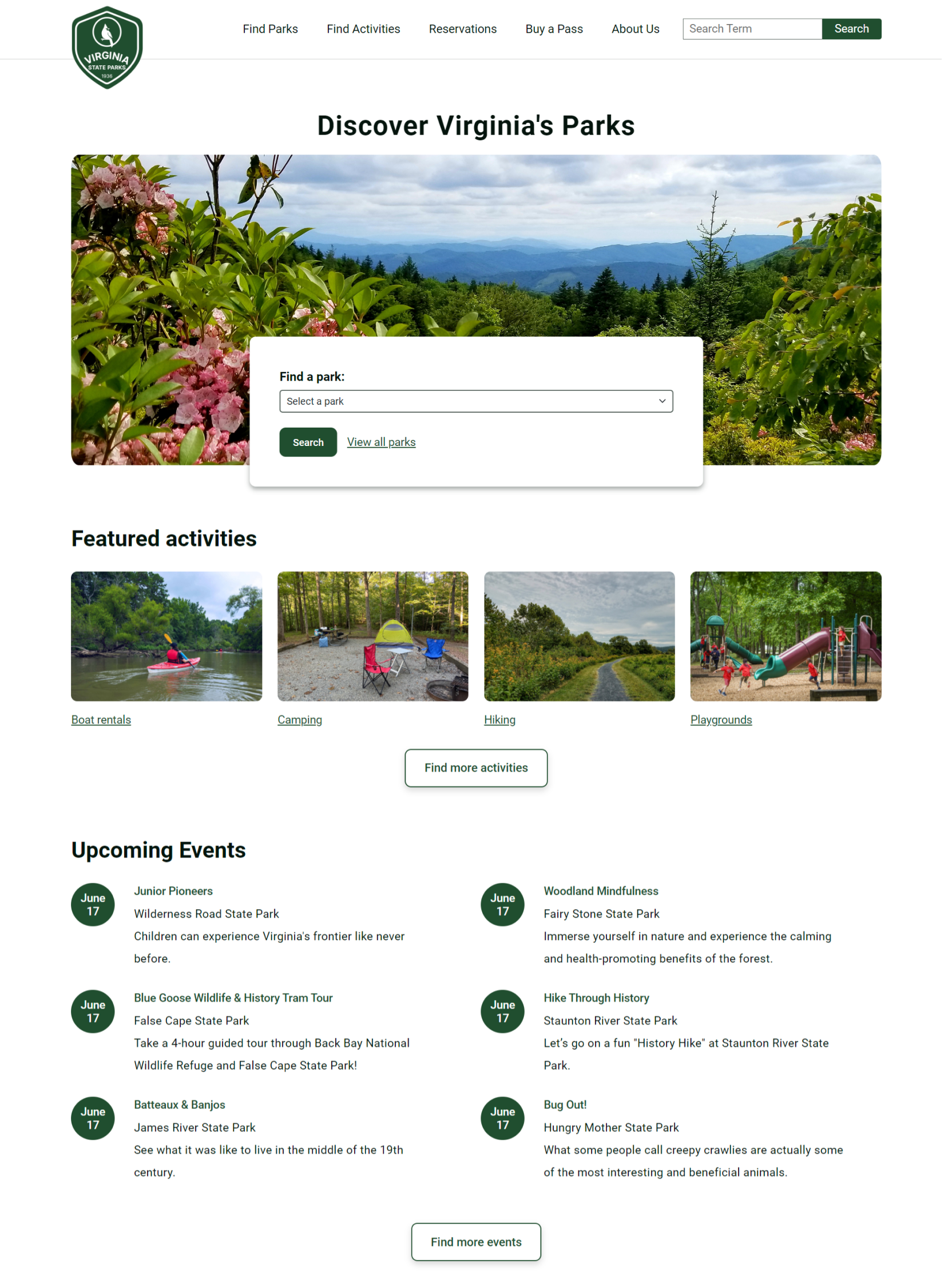
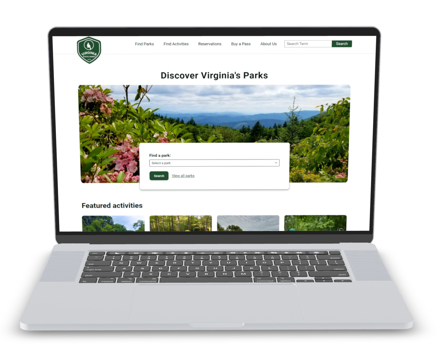
After completing a UX/UI BootCamp, I revisited the Virginia State Parks website with enhanced front-end and design skills. My redesign aimed to modernize the experience, making it faster and easier for users to find parks
Timeline:
4 weeks
Type:
Project redesign
Stack:
Monday.com
Adobe
Sass
Bootstrap
Netlify
Project Planning & Research
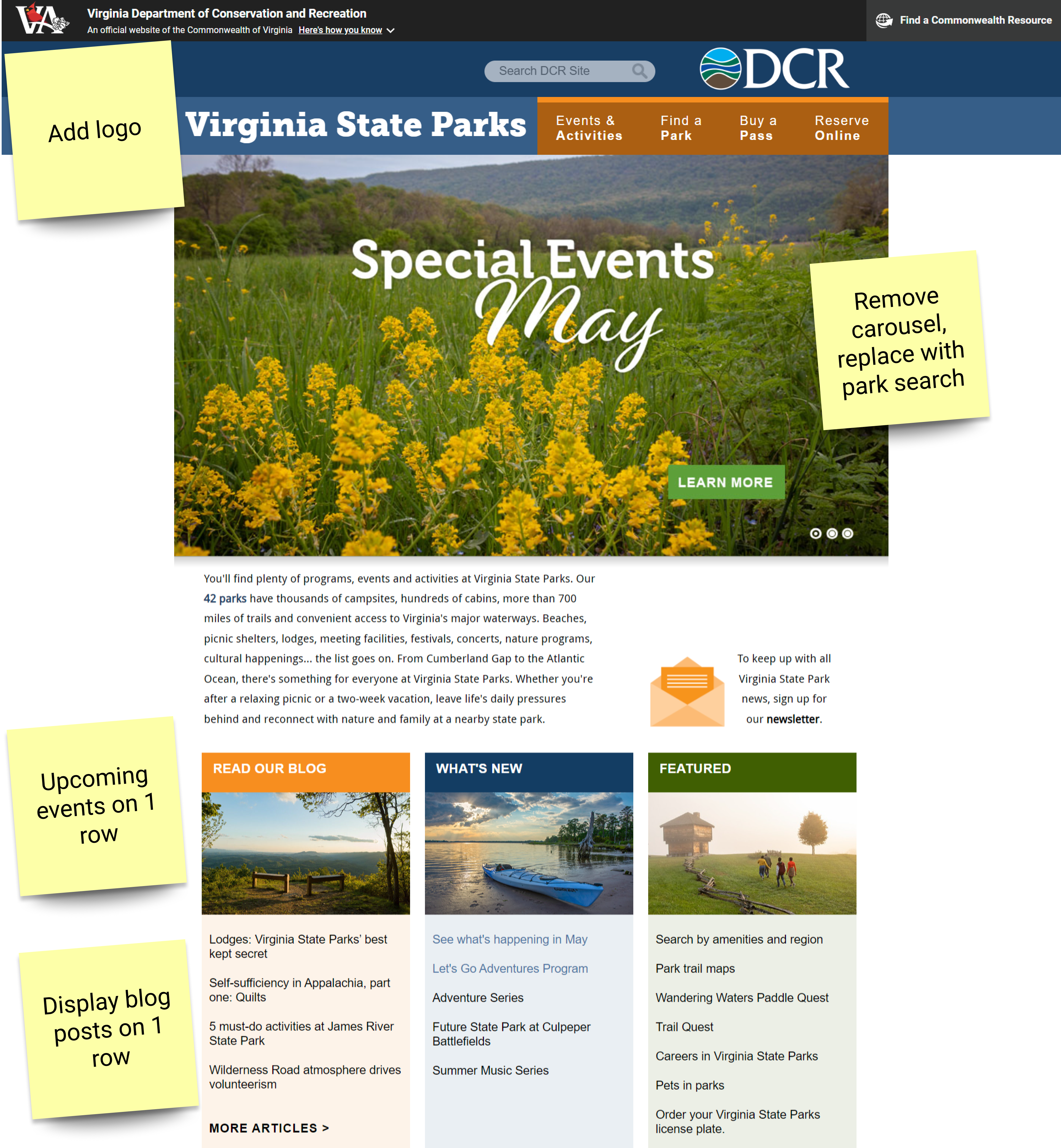
I started by analyzing several state park websites to identify effective design features, including color schemes and typography. This research shaped the visual and functional blueprint of the redesigned website.
Next, I performed a detailed audit of the existing Virginia State Parks website. I identified areas needing updates, cataloged current functionalities, and identified gaps. These insights led me to propose innovative features and develop a content strategy aimed at boosting user engagement and meeting visitor needs.
Design Phase
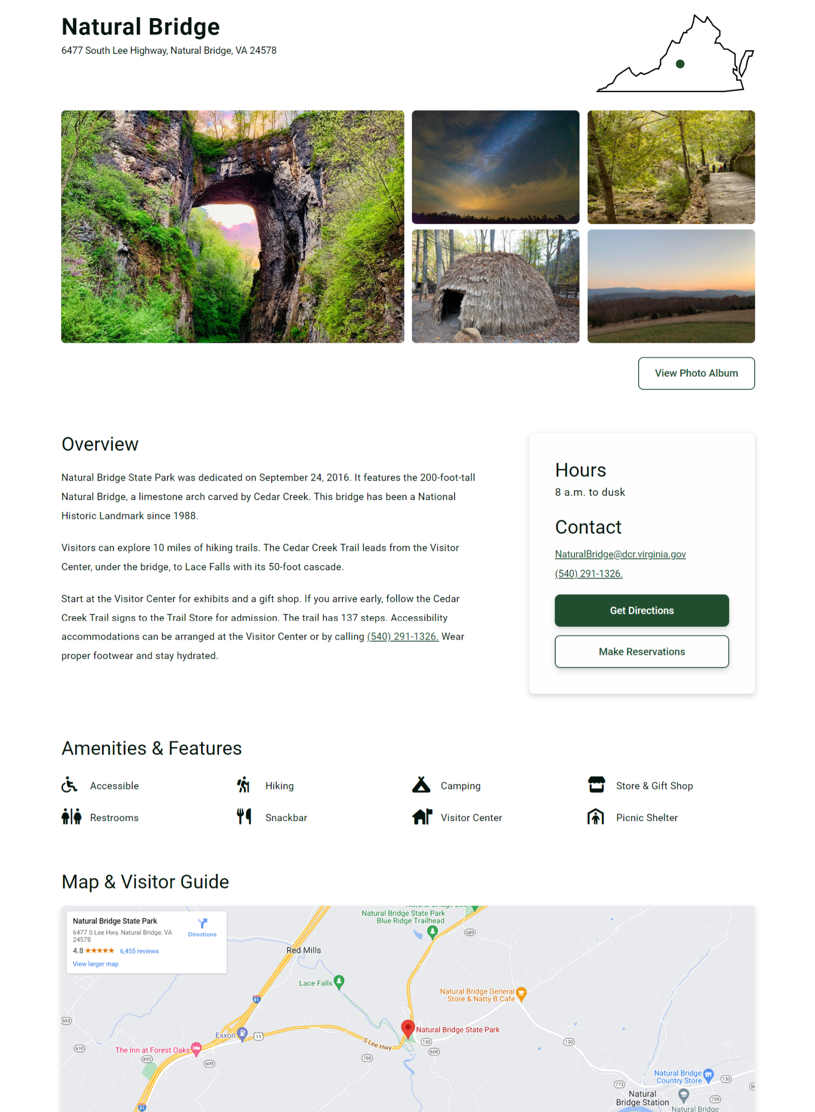
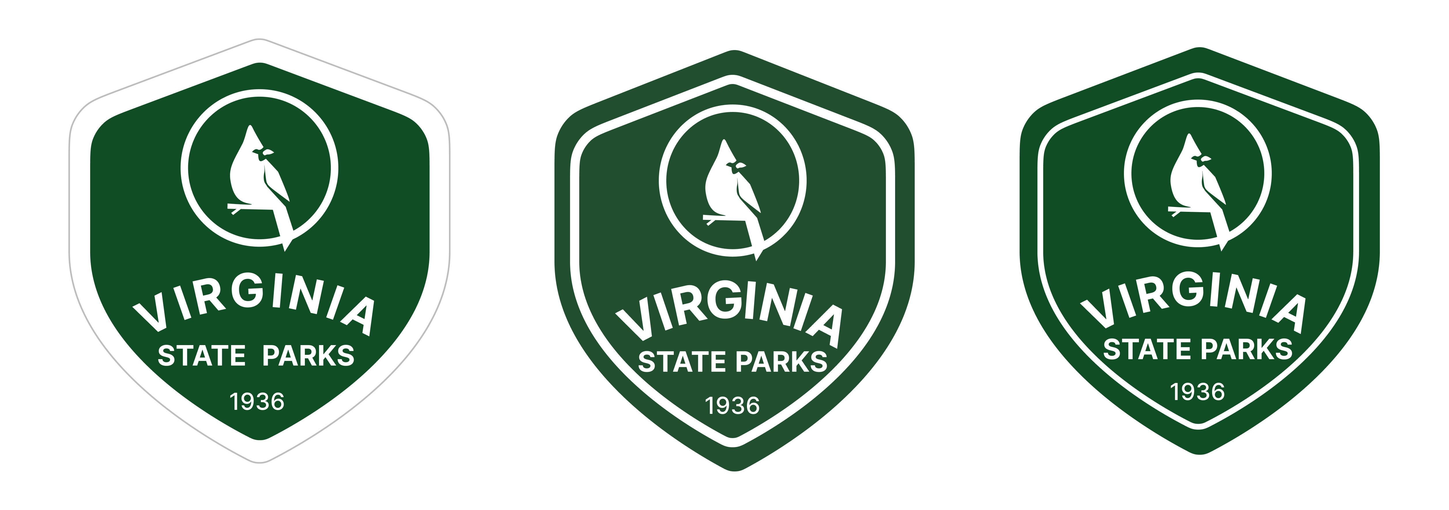
I started by studying design features and aesthetic elements from other state parks. This research guided the creation of a new logo and shaped the site's overall visual strategy. I then crafted detailed wireframes for the homepage and Natural Bridge park page, emphasizing intuitive navigation. These wireframes were iteratively refined through A/B testing with users to ensure a consistent user flow and optimal user experience throughout the site.
Development Phase
I turned the designs into a functional website. Using HTML and Bootstrap, I built a solid structure, and Sass allowed for precise styling. This approach ensured the site was scalable and accessible. I integrated a park search feature using JavaScript to immediately speed up park discovery and enhance user engagement.
To boost the website's performance, I compressed all images, which significantly cut down load times and improved the Lighthouse score. Regular testing for browser compatibility and accessibility was conducted using tools like WAVE and Lighthouse, ensuring compliance with WCAG 2.2 standards.
Reflecting
Reflecting on this project, I enjoyed every step, from initial planning to the final touches. Using project management software like Monday.com helped me stay organized and ensure every aspect of the project was executed flawlessly. Designing the logo in Figma was especially rewarding, as it involved researching effective designs and creatively capturing the essence of Virginia State Parks.
Selecting photos for the website was a personal highlight. Having lived in Virginia and visited many of these parks, I brought a personal touch to the image selection process, making it both personal and fulfilling. Overall, this project not only sharpened my technical and design skills but also enhanced my appreciation for Virginia's natural landscapes.
Thanks for stopping by!
I appreciate you checking out my work!
Feel free to email me or connect through LinkedIn.
